Feature #1074
closedReimplement ActionBarDrawerToggle to get rid of the wasted padding
0%
Description
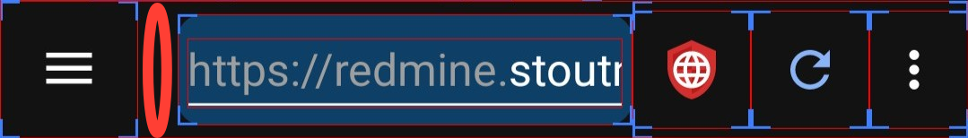
It would be nice to enlarge the URL input eliminating the empty space between the said input and the hamburger button (named "Open navigation drawer").
Also, you can see that the width of the hamburger button and the other buttons is not the same. Maybe, you should narrow the hamburger button's width.
You can also notice that the three-dots button has less width than the two buttons on its left ("JavaScript" and "Refresh" buttons). Maybe, you can also narrow these two buttons width.
See the screenshot below.

Files
| pb.app-bar-layout.jpg (29.9 KB) pb.app-bar-layout.jpg | |||
| pb.empty-space.png (111 KB) pb.empty-space.png | |||
| Implementation.png (15.1 KB) Implementation.png |
Updated by Soren Stoutner almost 3 years ago
I address this at the following URL under the section "Reuse existing Android elements as much as possible".
https://www.stoutner.com/privacy-browser-design-guidelines/
I would suggest you read that first and then add any comments you might have.
Updated by ask low almost 3 years ago
I have a fairly small device (6") & I have no issues with the address bar here.
The space utilization is not that bad currently. If you need to peek in little bit more of the URL, I would consider you to disable "Extra button" in settings which'll disable refresh icon. You can still refresh either via gesture, or from the menu.
I think there is no need to narrow down or up any of the existing buttons. Infact, I would even recommend Soren to expand 3 dot menu into a square. Because I had mishits accessing the menu a lot of times.
Updated by v ... almost 3 years ago
- File pb.empty-space.png pb.empty-space.png added
@Soren Stoutner, thanks for the link, I never read this page until the end. Now, I'm OK with the different button widths, even if I don't fully understand why these differences. Google seems to have designed them in this way, and it's safer/easier/maintainable to use them without (or with minimum) alterations.
However, do you know why this empty space outside the hamburger icon and the URL input paddings ? I don't understand.
![]()
Updated by v ... almost 3 years ago
@asklow, I intentionally enabled the "Display additional app bar icons" setting, because I want to be able to quickly access to the refresh trigger (menu/button), so it's a no go via the more (kebab) button, and I don't like the refresh gesture, because I often want to check if I'm on the top of the page, which previously was often triggering a refresh of the page.
Updated by Soren Stoutner almost 3 years ago
- Subject changed from More space for the URL input to Reimplement ActionBarDrawerToggle to get rid of the wasted padding
- Priority changed from 3.x to 4.x
@v, the extra padding between the hamburger menu and the rest of the URL bar is automatically added by Android's `ActionBarDrawerToggle`.
https://developer.android.com/reference/androidx/appcompat/app/ActionBarDrawerToggle
It is very annoying and, in my opinion, wasted space. But I don't think I could get Google to change it, and, so far, it hasn't felt worth it to reimplement the drawer toggle myself. This is something that, if I ever get to the end of the 4.x series and have nothing else to spend my time on, I would probably do.
Updated by ask low almost 3 years ago
What do you think about the current Material You design standard ?
I think there is an issue tracker somewhere I need to search and watch it.
Updated by Soren Stoutner almost 3 years ago
I generally don't like most of Google's current design language. It tends to have poor information density (there is a small amount of information displayed for the amount of screen real estate consumed). Beyond that, I find the Material You color theming to be ugly, and to force other ugly design decisions, like the push for monochromatic launcher icons.
So far, it is possible to design for Android using standard Android components without getting sucked into the Material You nonsense. Given Google's track record, about the time they would start forcing Material You onto the standard components, they will move on to something "so much better than that dated looking Material You". However, if that isn't what happens and everyone has to adopt a Material You design on Android, then I will probably find the least ugly and most user-empowering way to do so.
Updated by Soren Stoutner over 2 years ago
- Priority changed from 4.x to Next Release
Updated by ask low over 2 years ago
What do you think about Chrome's design itself ? The information density of it, is not as bad as material you design.
https://9to5google.com/2023/01/24/chrome-address-bar-redesign/
<HOME> <ADDRESS-BAR> <TABS> <MENU>
On privacy browser, it's
<SIDEBAR> <ADDRESS-BAR> <JS> <MENU>
But with inconsistent paddings, which happened to be caused by standard library function ActionBarDrawerToggle.
Material You standard is primarily incorporated by Compose with Dart language. But obviously independent of any framework/language.
I think part of the issue with interface density, is that people became lazy, lost focus hitting small buttons & their thumbs got fat due to their overweight diets (sorry pun intended ;D)
Neither I complain about monocoloured icons, as they mostly depict uniformity. But for the color blind people, it becomes difficult to distinguish between them. I literally use OLauncher mini, which is a dead simple launcher without any icons. It's just 23 kB lmao.
https://apt.izzysoft.de/fdroid/index/apk/app.olauncher.light
Updated by Soren Stoutner over 2 years ago
The ActionBarDrawerToggle, as currently used in Privacy Browser (not how it was used years ago) ends up being rather easy to replace with a static icon where I can control the padding. So, I think I will do that.
Updated by ask low over 2 years ago
@v, another hacky way I've found to refresh the page without refresh function, is to quickly double tap JS lmao.
No need to enable additional icon on toolbar.
Updated by Soren Stoutner over 2 years ago
Replacing the ActionBarDrawerToggle will fix all the problems on the left. It will not make any changes to the icons on the right, which are created by the Options menu.
Updated by Soren Stoutner over 2 years ago
- File Implementation.png Implementation.png added
- Status changed from New to Closed
Implemented in commit: https://gitweb.stoutner.com/?p=PrivacyBrowserAndroid.git;a=commitdiff;h=6b662fcb3e0c8dfbdc212e55d10ad291ec569280;ds=sidebyside
The results:
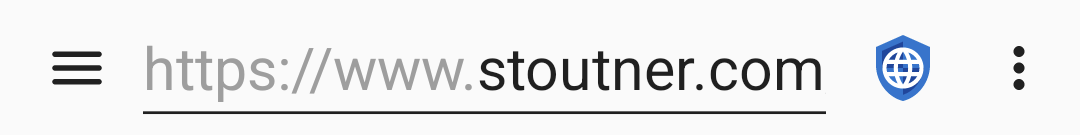
Note that the system controls the padding on the left of the icon, which is a little more than I would like. I control the padding between the icon and the URL EditText, which is set to 8dp. This is a bit less than the padding on the left or the padding between the URL EditText and the Options Menu icons (which I also don't control), but it is close enough that it doesn't look odd while maximizing the amount of space left for the URL EditText.
Updated by Soren Stoutner over 2 years ago
I increased the padding to 10dp, because 8dp looked off-balance when Domain Settings were enabled.