Forums » Privacy Browser Android Forum »
Icons and font size in the bookmarks drawer
Added by Soren Stoutner over 8 years ago
A user recently asked me about the disparity in layout between the navigation drawer and the bookmarks drawer. The purpose of this forum post is to provide users with a place to comment on their preferred design.
First, a list background on why things are the way they are.
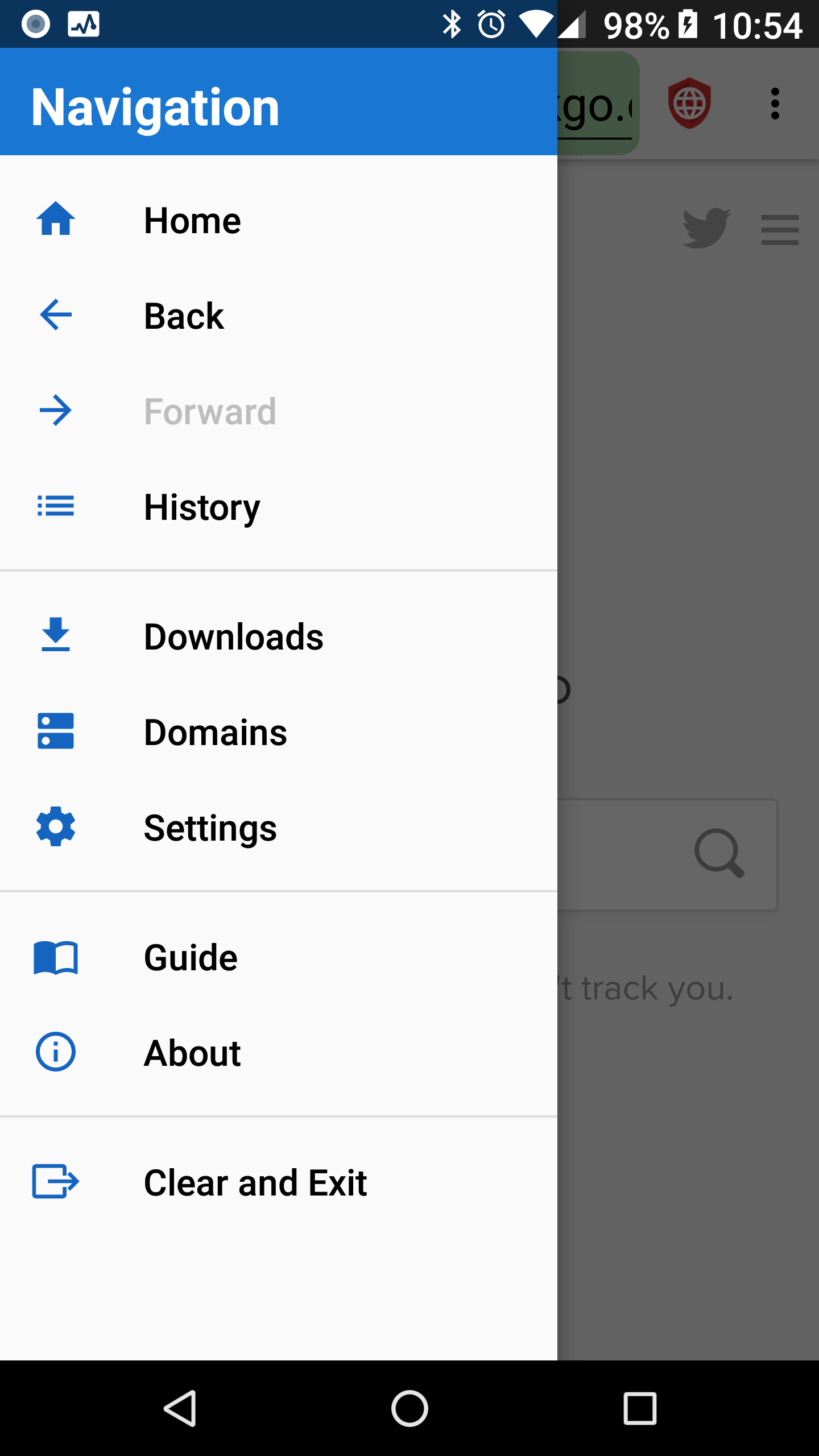
The navigation drawer is an Android system feature. It does not provide an option to the app developer to control the font size or the icon layout. The are some limited controls for the color of the icons, but not much else. In my personal opinion, the fonts and the icons in the navigation drawer are too small and there is too much white space around the icons. It would be possible to replace the navigation drawer with a custom drawer, but there are advantages to using the OS provided options in terms of integration with the rest of the system, and I like to use them as much as possible.
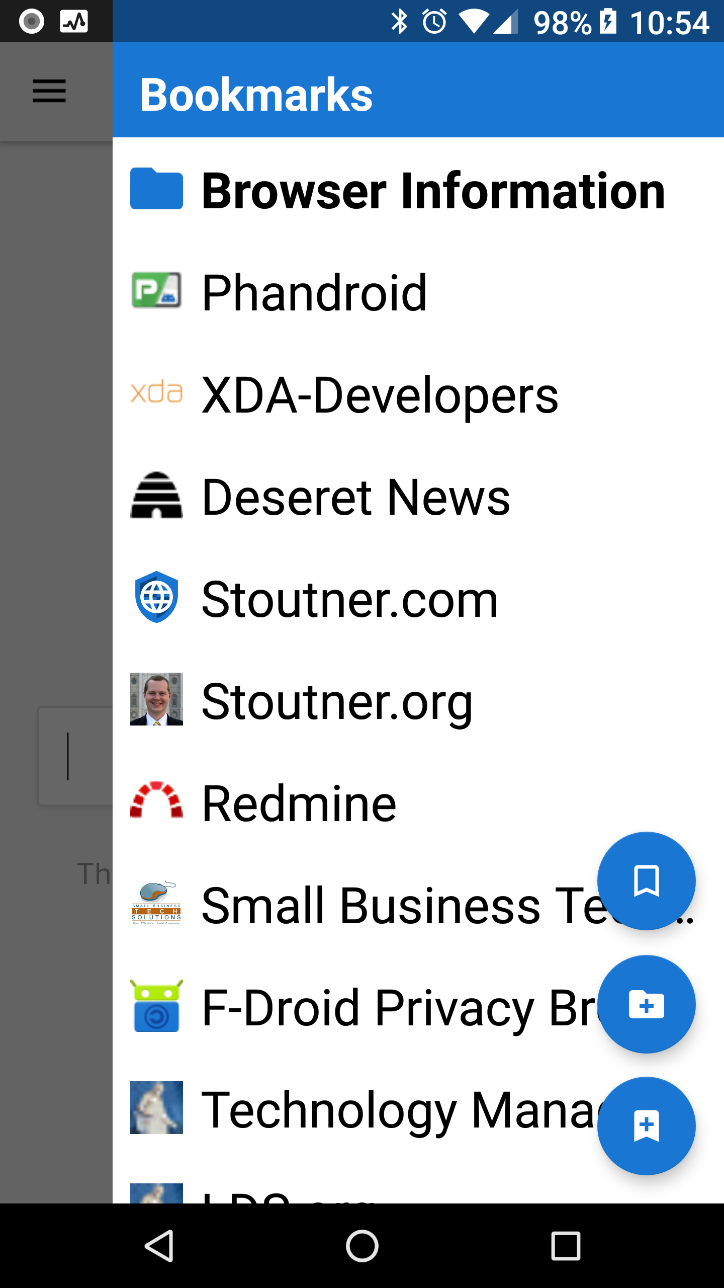
The bookmarks layout was originally designed for the bookmarks activity. As such, it is a custom layout that I designed from scratch according to what I thought looked best. The guiding principles were these.
1) Each entry needs to be big enough and separate enough that a user does not accidentally select the wrong bookmark.
2) The entries should be small enough to fit a reasonable number on the screen at one time.
3) The font and icon should be as large as possible within the constraints of 1 and 2.
The bookmark drawer uses the same layout as the bookmark activity. Among other things, this makes it so that opening the bookmark activity from the bookmark drawer feels natural, instead of being a jarring change in the layout.
The two layouts hold similar numbers of entries. On my Nexus 6P, with the OS font size set to largest, the navigation drawer can display 11 entries on the screen. The bookmarks drawer can display 10.5 entries.
Of course, different people prefer different layouts and font sizes. If there were a strong consensus among users I would not be opposed to altering the layout of the bookmarks drawer and activity.
For comparison purposes, the options menu (which is managed by the OS) uses a larger font than the navigation drawer. I have always thought it odd that they don't match. The history dialog, which is a custom layout, uses a similar design to the bookmarks drawer, but with a smaller font so that more of the URL is visible (the icons are the same size).
Replies (2)
RE: Icons and font size in the bookmarks drawer - Added by Brian Toole over 8 years ago
In my opinion, the current design is perfectly fine. If you did look to change it, how feasible would it be to just add an option to implement an option along the lines of "Use System Layout for Bookmark Drawer" to give people the option of going for the custom look vs the system look?
RE: Icons and font size in the bookmarks drawer - Added by Soren Stoutner over 8 years ago
It would be fairly complex, although not impossible, to toggle between the default layout and a custom layout (because they are not created in the same fashion). So if I were to do something different, it is unlikely that I would try to maintain multiple layouts. But at this point, unless I hear a strong consensus from users, I am not planning to make any changes because I prefer to use the development time for the other features that are already planned.